branding
Scoop Ice Cream
The Social Scoop
JUDE™ // The social scoop
case study
Scoop Ice Cream
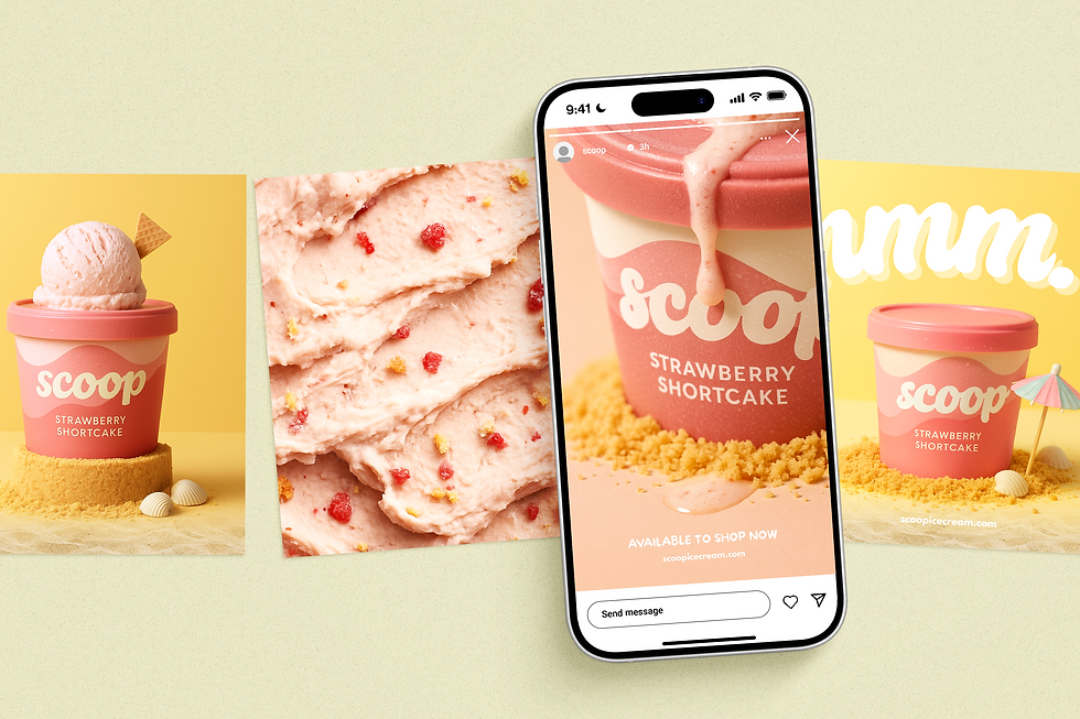
Scoop is a pastel-forward ice cream brand with a playful, premium personality. We were commissioned to build the brand from the ground up—strategy, identity, and packaging—then launch it with a social-first campaign. The identity centres on a soft, whipped wordmark, a gelato-wave pattern system, and flavour colourways (blush, sky, cocoa) that feel sun-washed and luxurious. We developed the full kit: logo suite, colour system, typography pairings, pattern library, icon set, packaging layouts, tone-of-voice and usage guidelines—ensuring the brand is unmistakable on shelf and on screen.
To activate the identity, we created The Social Scoop, a scroll-stopping content series designed for both organic and paid. Four visual worlds—Beach Day Minis, Pool Ripple, Fruit Orbit, Pastel Picnic—translate the brand into tactile scenes with biscuit “sand”, sun-lit ripples, fruit halos and clean gradients. We produced hero stills, flat-lays, macro texture studies and ad-ready pack shots across 4:5, 1:1, 9:16 and 16:9, paired with tight copy lines (“Suns out. Scoops out.” “Shortcake, long summer.”). The result is a cohesive, luxe-but-fun toolkit that drives recognition, brings flavour stories to life, and gives the team endlessly recyclable assets for launches, promos and always-on content.
Scope of Work
branding & identity // social launch campaign